
Rebuilding Andrea Ross’s website around her evolving personal brand
I led the end-to-end redevelopment of Andrea Ross’s website, creating a clear, mobile-first platform that brings together her work as a stunt performer, coordinator, filmmaker, coach and speaker.
Role
Product Manager, Strategist & Website Builder
Platform
Wix
Delivery
End-to-end ownership
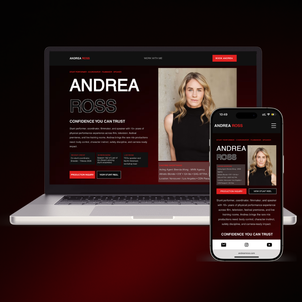
Andrea’s previous website did not reflect the full scope of her work and was difficult to use, particularly on mobile.
Important projects, credentials and services were buried within an unclear structure. The site also failed to represent Andrea in the visual style and language she wanted, making it harder for casting teams, production contacts and event organisers to quickly understand what she offered.
I treated the website as a product problem rather than a visual redesign.
I worked with Andrea to clarify her goals, audiences and positioning before defining the structure, content hierarchy and user journeys. I then managed the design, copy, Wix development, responsive testing, SEO and GEO setup, launch and handover.
From an unclear brief to a focused, working platform
The project moved through five connected stages, allowing the strategy, content and build to evolve together rather than treating them as separate pieces of work.
I explored Andrea’s goals, audience, strongest work and frustrations with the previous site.
I translated the findings into clear requirements, user journeys and a more focused content structure.
I used Claude to explore an initial page direction, then refined the hierarchy and visual decisions.
I developed the site in Wix, tested every page across devices and iterated with Andrea’s feedback.
I completed the SEO setup, connected Search Console and prepared the site for ongoing ownership.
The website now presents Andrea at the level of the work she is already doing
The biggest improvement is not simply visual. The site now communicates Andrea’s value clearly, works properly across devices and gives each audience a direct route to the information they need.
Clearer positioning
Andrea’s work across stunts, coordination, filmmaking, and coaching is easier to understand.
Mobile-first usability
The experience is readable, responsive and intentionally structured across every screen size.
Stronger path to enquiry
Visitors can move from discovering Andrea’s work to contacting her without having to interpret the site.
Four decisions that shaped the final site
Each part of the build addressed a specific problem, without turning the case study into a screen-by-screen walkthrough.
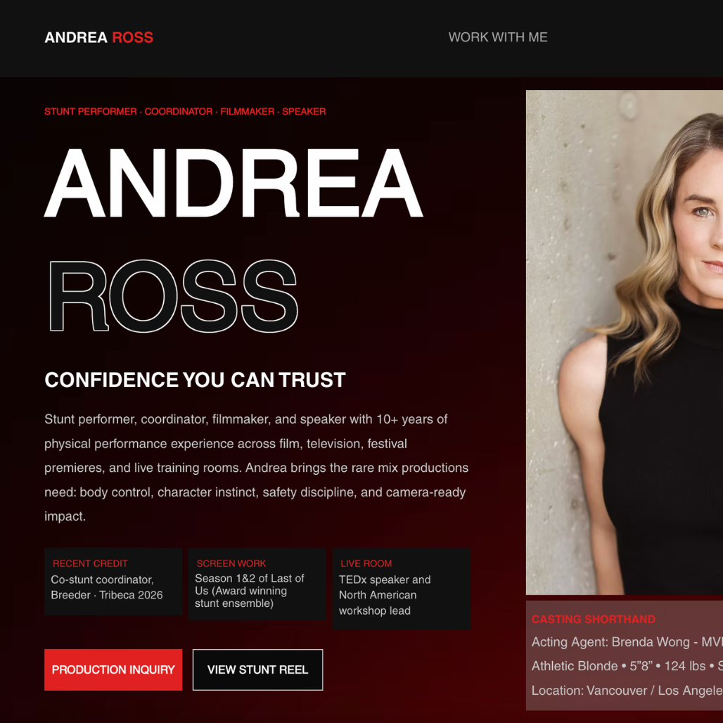
Lead with positioning
The homepage explains who Andrea is and what she does before visitors need to search for context.
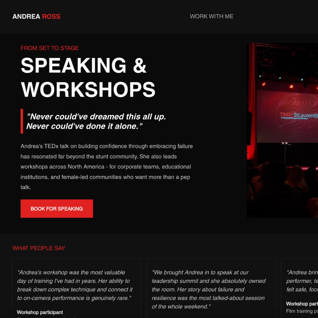
Organise around audiences
Different visitor groups now have clearer entry points into the part of Andrea’s work most relevant to them.

Simplify the enquiry journey
Consistent calls to action and a more structured contact flow reduce friction before someone gets in touch.
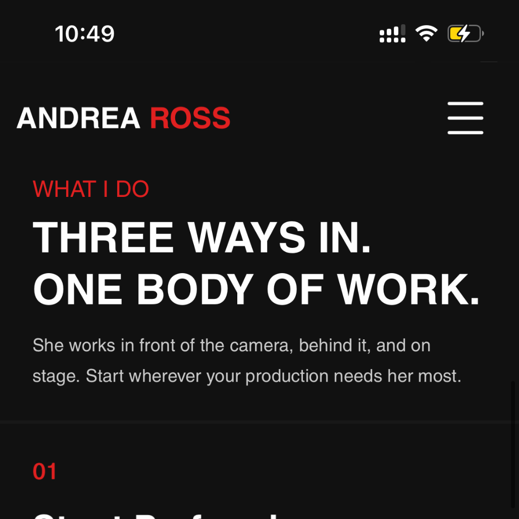
Design responsively
Desktop, tablet and mobile layouts were reviewed separately instead of treating mobile as a final adjustment.
AI accelerated exploration, not decision-making
I used Claude to explore the initial page direction and turn early content requirements into a visual starting point. I then refined the information architecture, hierarchy, copy and responsive behaviour before building the final experience in Wix.
This project shows how I combine product thinking with hands-on execution to turn a client’s goals into a clear, usable and maintainable digital experience.